


 Apex Code Development
 You need to sign in to do that
Don't have an account?
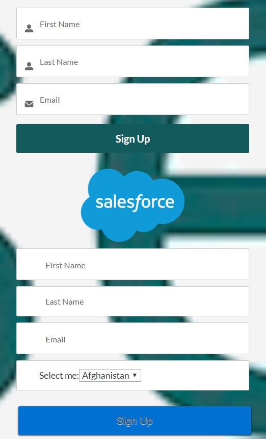
Cloned Lightning Component CSS (from a standard lightning component) not working
I've recreated the 'selfRegister' standard community lightning component. I copied all the component code from it and created a new lightning component. However the styling doesnt look the same. As you can see from the image below, the top one is the standard one, the bottom one is the clone.
What can I do to make them look the same, what could I pehaps check, change, ajust/look into to get the same look & feel?
Below is th component (.cmp) and stylling (.css)
Standard CSS.(Nothing edited)
What can I do to make them look the same, what could I pehaps check, change, ajust/look into to get the same look & feel?
Below is th component (.cmp) and stylling (.css)
<aura:component controller="LightningSelfRegisterController2" implements="forceCommunity:availableForAllPageTypes">
    <!-- Removed some of the code----->

    <div>
            <aura:renderIf isTrue="{!v.showError}">
                <div id="error">
                    <ui:outputRichText value="{!v.errorMessage}"/>
                </div>
            </aura:renderIf>
            <div id="sfdc_username_container" class="sfdc">
                <span id="sfdc_user" class="login-icon" data-icon="a"></span>
                <ui:inputText value="" aura:id="firstname" placeholder="{!v.firstnameLabel}" keyup="{!c.onKeyUp}" class="input sfdc_usernameinput sfdc"/>
            </div>

            <div id="sfdc_nickname_container" class="sfdc">
                <span id="sfdc_user" class="login-icon" data-icon="a"></span>
                <ui:inputText value="" aura:id="lastname" placeholder="{!v.lastnameLabel}" keyup="{!c.onKeyUp}" class="input sfdc_usernameinput sfdc slds-icon_container slds-icon-utility-user inputIcon slds-button__icon forceIcon"/>
            </div>

            <div id="sfdc_email_container" class="sfdc">
                <span id="sfdc_user" class="login-icon" data-icon="k"></span>
                <ui:inputText value="" aura:id="email" placeholder="{!v.emailLabel}" keyup="{!c.onKeyUp}" class="input sfdc_usernameinput sfdc"/>
            </div>

            <div id="sfdc_email_container" class="sfdc">
                <span id="sfdc_user" class="login-icon" data-icon="k"></span>
                <ui:inputSelect aura:id="country" label="Select me:" class="input sfdc_usernameinput sfdc dynamic"/>
            </div>


            <aura:iteration aura:id="extraFields" items="{!v.extraFields}" var="curField" indexVar="index">
                <div id="sfdc_extrafield_container" class="sfdc">
                    <span id="sfdc_user" class="login-icon" data-icon="a"></span>
                    <ui:inputText value="{!curField.value}" aura:id="{!curField.fieldPath}" placeholder="{!curField.label}" keyup="{!c.onKeyUp}" class="input sfdc_extrafieldinput sfdc"/>
                </div>
            </aura:iteration>

            <aura:renderIf isTrue="{!v.includePasswordField}">
                <div id="sfdc_password_container" class="sfdc">
                    <span id="sfdc_lock" class="login-icon sfdc" data-icon="c"></span>
                    <ui:inputSecret value="" aura:id="password" placeholder="{!v.passwordLabel}" keyup="{!c.onKeyUp}" class="input sfdc_passwordinput sfdc"/>
                </div>

                <div id="sfdc_confirm_password_container" class="sfdc">
                    <span id="sfdc_lock" class="login-icon sfdc" data-icon="c"></span>
                    <ui:inputSecret value="" aura:id="confirmPassword" placeholder="{!v.confirmPasswordLabel}" keyup="{!c.onKeyUp}" class="input sfdc_passwordinput sfdc"/>
                </div>
            </aura:renderIf>

            <div class="sfdc">
                <ui:button aura:id="submitButton" label="{!v.submitButtonLabel}" press="{!c.handleSelfRegister}" class="sfdc_button"/>
            </div>
    </div>
</aura:component>
Standard CSS.(Nothing edited)
.THIS #sfdc_username_container{
    margin-bottom:10px;
    padding: 12px;
    background-color:white;
    border: 1px solid #CCC;
    -webkit-border-radius: 2px;
    -moz-border-radius: 2px;
    border-radius: 2px;
}

.THIS #sfdc_nickname_container{
    margin-bottom:10px;
    padding: 12px;
    background-color:white;
    border: 1px solid #CCC;
    -webkit-border-radius: 2px;
    -moz-border-radius: 2px;
    border-radius: 2px;
}

.THIS #sfdc_email_container{
    margin-bottom:10px;
    padding: 12px;
    background-color:white;
    border: 1px solid #CCC;
    -webkit-border-radius: 2px;
    -moz-border-radius: 2px;
    border-radius: 2px;
}

.THIS #sfdc_extrafield_container{
    margin-bottom:10px;
    padding: 12px;
    background-color:white;
    border: 1px solid #CCC;
    -webkit-border-radius: 2px;
    -moz-border-radius: 2px;
    border-radius: 2px;
}

.THIS #sfdc_user{
    float:left;
    width:23px;
    height:25px;
    padding-top:1px;
    padding-left:2px;
    margin:0px;

}

.THIS #sfdc_lock{
    float:left;
    width:23px;
    height:25px;
    padding-top:1px;
    padding-left:2px;
    margin:0px;
}

.THIS .login-icon {
    color:#ccc;font-size:22px;
}

.THIS #sfdc_password_container{
    margin-bottom:10px;
    padding: 12px;
    background-color:white;
    border: 1px solid #CCC;
    -webkit-border-radius: 2px;
    -moz-border-radius: 2px;
    border-radius: 2px;
}

.THIS #sfdc_confirm_password_container{
    padding: 12px;
    background-color:white;
    border: 1px solid #CCC;
    -webkit-border-radius: 2px;
    -moz-border-radius: 2px;
    border-radius: 2px;
}

.THIS button.sfdc_button {
    width: 100%;
    margin-top: 15px;
    margin-bottom: 5px;
    color: #fff;
    background-color: #0070d2;
    border-color: #357ebd;
    display: inline-block;
    text-align: center;
    vertical-align: middle;
    background-image: none;
    border: 1px solid transparent;
    white-space: nowrap;
    padding: 10px 12px;
    font-size: 16px;
    font-family: 'Open Sans', sans-serif;
    font-weight: 300;
    line-height: 1.42857143;
    border-radius: 2px;
    -webkit-user-select: none;
    -moz-user-select: none;
    -ms-user-select: none;
}

.THIS button:hover {
    background-color:#3276b1;
    border-color:#285e8e;
    cursor:pointer;
}

.THIS input {
    margin-left:10px;
    margin-top: 3px;
    border: 0px solid transparent;
    width: 70%;
    -webkit-appearance: none;
    font-size: 14px;
}

.THIS #sfdc_forgot{
    font-family: 'Open Sans', 'sans-serif';
    font-weight:300;
    font-size: 14px;
    margin-top: 10px
}

.THIS #error {
    text-align: center;
    color:#FF0000;
}

.THIS a {
    color:white;
    text-decoration: none;
}
.THIS a:hover {
    color:white;
    text-decoration: none;
}

.THIS input[type="checkbox"] {
    appearance: none;
    border: 1px solid white;
    height: 22px;
    width: 22px;
    vertical-align: middle;
}

.THIS input[type="checkbox"]:checked {
    border: 1px solid ;
}

.THIS input[type="checkbox"]:checked:after {
    display: block;
    position: relative;
    content: '';
    left: 3px;
    top: 3px;
    height: 6px;
    width: 10px;
    border-bottom: 4px solid /*#354452*/ white;
    border-left: 4px solid /*#354452*/ white;
    transform:rotate(-45deg);
}

.THIS input[type="checkbox"].disabled {
    opacity: 0.35;
}

.THIS input[type="checkbox"] + label {
    vertical-align: middle;
}
 Vandana Jaiswal 7
were you able to find the solution?