function readOnly(count){ }
Starting November 20, the site will be set to read-only. On December 4, 2023,
forum discussions will move to the Trailblazer Community.
+ Start a Discussion
Malhar Patel PatelMalhar Patel Patel 

Superbadge - Lightning Reports and Dashboards - challenge 6 - Temperature to kWh Research

For life of me I can't figure out what this exercise is asking to do.  I was able to modify other reports but this particualr R&D report, Temperature to kWh Research, I'm not able to do.  Error is keep saying, "We can’t find the additional analysis by model being performed on the 'Temperature to kWh Research' report. Remember that you can organize data horizontally and vertically at the same time."

User-added image


Best Answer chosen by Malhar Patel Patel
John McGuigan 28John McGuigan 28
Needs to be a Matrix report, with horizontal bars.

All Answers

Malhar Patel PatelMalhar Patel Patel
Please, can anyone help out?  I'm not sure whats wrong this one report and I'm not getting anywhere.  
John McGuigan 28John McGuigan 28
Malhar, I am experiencing the exact same issue. My chart looks very much like yours however I have the "Very High" category. Make sure you have that one too.User-added image
Malhar Patel PatelMalhar Patel Patel
ok so for bucket I was using All time panel temperature as the filter, instead of Panel Temperature.  And now it shows very high results.  But, likewise I'm not getting anywhere else. 
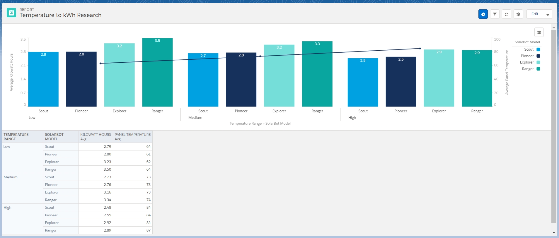
Also, may I ask what is that range of 0-800 on right side of your y-axis?  mine is for average panel temperature(0-100) and overall line is flat.  And do we have different data, my average kilowatt hours is at 2.97 and yours shows 2.94
 
John McGuigan 28John McGuigan 28
Make sure you have four bucket categories, it seems you have only three. The four are: Low, Medium, High, Very High. That may explain some of the variations.
Malhar Patel PatelMalhar Patel Patel
I do have 4 categories with correct buckets, I initially had set my filter for all time panel temperature instead of Panel temperature.  Somehow it passed previous challenge for this report.  But stuck here till someone guides us. 
John McGuigan 28John McGuigan 28
Needs to be a Matrix report, with horizontal bars.
This was selected as the best answer
John McGuigan 28John McGuigan 28
https://developer.salesforce.com/forums/ForumsMain?id=9060G0000005l3SQAQ

 
Malhar Patel PatelMalhar Patel Patel

umm wow.  I even splitted buckets and models to make them horizontal and vertical, but stood with the fact that challenge mentioned "Place categories on the X axis, with count on the Y axis", so I always tried with vertical bar chart since thats what makes more sense with categories on X and numbers on Y.  I should have been done with this long time ago.  Thanks John.

shashi kumar 58shashi kumar 58
Superbadge
Lightning Experience Reports & Dashboards Specialist
Challenge No 4-
1. Create report -Name(Temperature to kWh Research)-solarboats and statusdata-Save report
2. Open report in classic and create bucket like below screenshot.
User-added image
Save report in R&D folder
3. Open report in Lighting and follow the screenshot.
User-added image
4.
User-added image
5. 
User-added image
6. User-added image

Check your challenge.
If fixed please markit as best ans.
RockfordealerRockfordealer
You saved me Shshi Kumar 58
Test TestUser 19Test TestUser 19
@shashi kumar 58  Thanks. It helped me pass my Challenge.
LaTashia SmithLaTashia Smith
I am still not seeing how to translate this into a Matrix report. Totally stuck .... 
Prachi Gupta 46Prachi Gupta 46
I have seen all the replies to above questions but , i am stuck on that my column field doesn't shows solarbot model field . so now i am not getting what to do. I am totally stuck upon that plz help
ANURAGH SERI 10ANURAGH SERI 10
Hi, @Prachi Gupta 46. I have had the same problem. By trying out all the option, I have deleted whatever is there in column grouping (no column grouping is required) and make sure to turn off Row Counts, Detail Rows, Subtotals, Grand Total. It worked for me. :) 
Thomas Dernbach 5Thomas Dernbach 5
Salesforce is not creating the matrix report for me when I add in my groups for rows and columns; it splits it off into a sperate graph or something really odd that is frustrating to say the least.
Anyone know what is happening and why?
User-added image
Eoin Quane 6Eoin Quane 6
@Prachi Gupta 46, revisit the custom report type = SolarBots and Status Data. Under Field Layout Properties for object SolarBots ensure that the field SolarBot Model is used in page layout.
John C SchaafJohn C Schaaf
Thanks so much, shashi kumar 58!!!
Arpit Kumar YadavArpit Kumar Yadav
Thanks Shashi kumar..!!
 
Jas SanghaJas Sangha
@shashi kumar 58 resolved the error I was receiving from the challenge, however, the challenge states "The graph should show the four temperature range categories from coolest to hottest, again broken down by model, and the average number of kilowatt hours." The graph that passes the challenge does not show average kilowatt hours, only average panel temperature. How is this possible?
Sharad Chandra Maheshwari 1Sharad Chandra Maheshwari 1

To the existing report-

1. Add an additional field/column called 'SolarBot Model'
2. SolarBot Model-> Group Columns by this field
3. Uncheck 'Stacked Summaries' at the bottom of the page
4. Add a bar chart and it should look like the examples shown in the above posts

Praveenkumar maradabudi 7Praveenkumar maradabudi 7
i have done the same as you said but still it shows error "We can’t find the additional analysis by model being performed on the 'Temperature to kWh Research' report. Remember that you can organize data horizontally and vertically at the same time."​​​​​​
Praveenkumar maradabudi 7Praveenkumar maradabudi 7
User-added image
Smita HodiggeriSmita Hodiggeri
@shashi kumar 58 Thank you,, this helped me resolve issue I was stuck on.
 
Taylor AllenTaylor Allen
I am having the Kilowatt Research issue. I am not sure what I do not have set up right. I have seen a couple posts where they have an option to sort rows by... I don't have that option when I am making the chart.
This is what mine looks like and I keep getting the 

We can’t find the component 'Temperature and Kilowatt Hour Relationship' using the correct report on the 'SolarBot Impact Dashboard'.

Error message. Any help would be great as I have been stuck at this point for the last 2 hours. I'm not sure if my report isn't correct. Only one model shows up on the report but I passed that step. User-added image
Ranil Goonesekera 5Ranil Goonesekera 5
@Taylor Allen  I have the identical issue.  Only difference is I have been stuck for days with no recourse:) Were you able to figureout why certain options are not showing up?  Thanks!
Abhishek ShakrawarAbhishek Shakrawar
Thanks Shashi..
Saket Ranjan 3Saket Ranjan 3
@thanks
shashi kumar 58
priya Burghate 16priya Burghate 16
Thank you so much shashi kumar 58 :-)
Rachana AwasthiRachana Awasthi
Thanks, @Shashi Kumar 58
Carol EckertCarol Eckert
@jas Sangha I found the same thing you did.  I had to remove the Avg Panel Temp in order to get the report to run and pass the challenge.  Thank you for posting that, I thought I was going crazy, it just wouldn't work.  This is what I ended up with as a passing chart.
User-added image
Stephanie MerrittStephanie Merritt
Thank you so much, a true life saver!! @shashi kumar 58   That was BRUTAL! 
Venkat Ramamurthy 5Venkat Ramamurthy 5
Actually, the error message points to the column distribution of the report - need to create Group By Columns on SolarBot Model column. This is the tricky part. If this is done, then the graph type is straightforward and follow the instructions straight from the question. It works!!
William Froelke 2William Froelke 2
That works!  Thank you shashi kumar 58 :)
Sharon Brittain 2Sharon Brittain 2

Does anyone else feel like the answer (...thanks @shashi Kumar, :))doesn't actually meet the criteria?? I have passed now thanks to Shashi but the challenge states Place categories (ie range and model) on the X axis, with count on the Y axis. The solution is opposite? Also the graph now doesn't show Average Kwh The graph should show the four temperature range categories from coolest to hottest, again broken down by model, and the average number of kilowatt hours.
I had a much better graph that actually fit the criteria and didn't pass :D , not usre that helped my understanding at all, just frustrated the hell out of me 

Thanks for listening :D :D 

Sumeet KaurSumeet Kaur
It really works @shashi kumar 58.Thanks for the help.
Carrie French 14Carrie French 14
Thank you so much @shashi kumar 58!
Mesme BestwickMesme Bestwick
@shashi kumar58. Thank you very much