


 Apex Code Development
 You need to sign in to do that
Don't have an account?
Why are lightning chart axis displayed differently?
I have a dashboard with various reports shown as charts in lightning in two environments. One is my dev and another is a test environment. Now for some odd reason, the charts are displayed a little differently between the two environments even though the the settings look identical in classic.
The issue is that we have two variables on the Y-axis. In the one environment, the two variable are displayed as so:
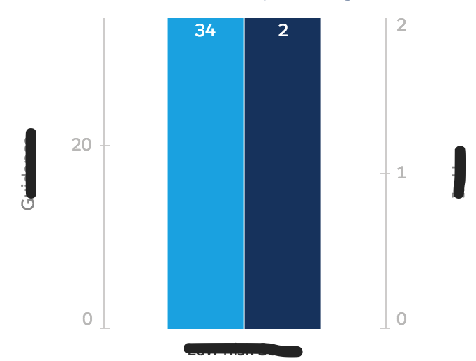
The two scales are even height but different values and on opposite sides. This is not what I want. In the other environment is looks as so:
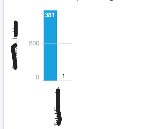
With both variables on one side, separated by a comma. In classic, the chart options are the same! One interesting thing is that for the chart that looks how i want (comma separated), i can click the edit button in lightning, but I cannot click that button for the other environment. Any help on this would be greatly appreciated!
Thanks
The issue is that we have two variables on the Y-axis. In the one environment, the two variable are displayed as so:
The two scales are even height but different values and on opposite sides. This is not what I want. In the other environment is looks as so:
With both variables on one side, separated by a comma. In classic, the chart options are the same! One interesting thing is that for the chart that looks how i want (comma separated), i can click the edit button in lightning, but I cannot click that button for the other environment. Any help on this would be greatly appreciated!
Thanks
Same boat as you on this one. What I got back from Support was "In Classic, all groups of data share the same Y-axis, while in Lightning, 2 groups of data will have 2 separate Y-axis, one on the left hand side and the other one on the right hand side."
If you know of any way to get around this, please let me know.
Thanks,
Eric
Not the greatest workaround, but this worked for my purposes so I thought I'd share.
On the chart editor, you can check "Show Reference Line" and set the "Reference Line Value" to the highest value from the first axis. You can hide the reference line by making it white, as well.
Hope this helps someone else, but you can also upvote this idea: https://success.salesforce.com/ideaView?id=0873A000000cNIfQAM
- G